All work

Web DevelopmentEducation / Membership2025
The Real World
Membership-based education platform.
Visit live siteEducation portal
Type
Membership & courses
Focus
Website
Deliverable
The challenge
Membership platforms lose most potential members not at the point of discovery but at the point of consideration. A visitor arrives with some level of interest, spends time on the site, and leaves without joining, not because they decided against it, but because they never got a clear enough picture of what they were actually buying. The Real World's offer is genuinely broad: nine campuses, step-by-step lessons, live sessions, a private community, and a subscription pricing model. That breadth is a strength, but it creates a presentation problem. Present it as a flat list and visitors face a wall of options with no clear entry point. Present it without sufficient context and visitors leave with unanswered questions (what is the commitment, what does day one look like, is this recorded or live) that become reasons not to join. A standard marketing website was not sufficient. The portal needed to function as a conversion asset: structured to guide a visitor from awareness to a confident purchase decision within a single session. That required decisions about information architecture, copy strategy, and flow design that go beyond visual execution. The specific challenges: how to present nine campuses without overwhelming visitors who arrive with a single primary interest; how to establish platform credibility without inflated claims; how to surface the community and live session elements that differentiate a membership platform from a static course library; and how to construct a FAQ that pre-empts the objections that kill conversion rather than the questions that are easiest to answer. The signup flow itself needed to be short enough to reduce decision paralysis while clear enough that visitors knew exactly what they were committing to.
The solution
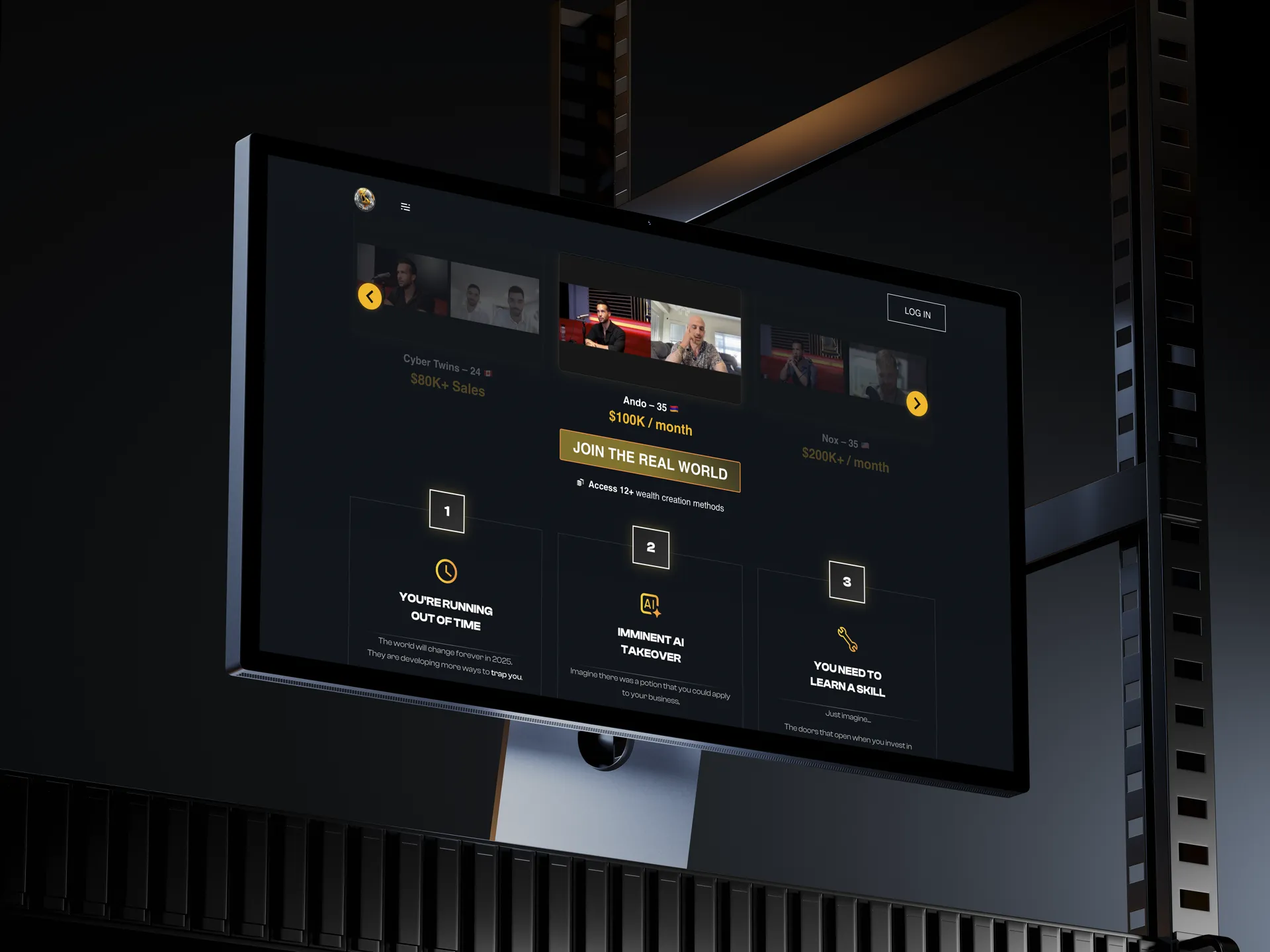
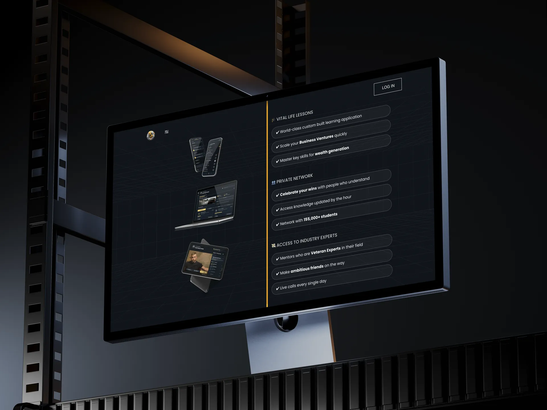
The portal was built around a campus-first information architecture. Rather than presenting a flat catalog of courses, the site leads with the nine campuses as distinct destinations. Visitors navigate to their primary interest first, understand what that campus offers (curriculum structure, lesson format, live sessions, community) and arrive at pricing already convinced of relevance. Self-selection at the campus level reduces churn from mismatched expectations after joining. Community proof elements are placed at decision-relevant points in the page structure, not relegated to a testimonials section. The platform's live session model and active community are framed as product features, because for a membership product they are. The FAQ was written to address the real conversion blockers: what happens after you join, whether content is live or recorded, what the monthly commitment looks like, and how cancellation works. These are the questions visitors answer for themselves when the site does not answer them, usually incorrectly, and usually as a reason to leave. The signup flow is single-path and mobile-first. Each step presents one decision, removes optional detours, and moves the visitor toward a clear action. On mobile, where a significant share of membership signups originate, the flow was optimised for thumb-reach and minimal form friction. Conversion copy throughout the portal is direct rather than promotional. The platform's value is concrete: specific campuses, specific lesson formats, live access, community. Copy that names these clearly outperforms copy that makes abstract claims about transformation.
Project details
The Real World (therealworldapp.com) is the official public portal for a membership-based education platform built around a campus model: nine subject areas (AI, business, client acquisition and social media, copywriting, crypto, e-commerce, fitness, and content creation), each functioning as a distinct learning environment with step-by-step lessons, live sessions, and a private community.
When a prospective member lands on the portal, they are not just browsing a course catalog. They are evaluating a subscription commitment: whether the platform is credible, whether the content matches their goals, and whether joining is worth it right now. The portal exists to answer those questions clearly and quickly, before asking for payment.
The information architecture was built around the campus model rather than a flat course list. This matters because visitors arrive with different primary interests. Someone drawn to copywriting and someone drawn to crypto are making different evaluations. Presenting all courses as a single undifferentiated list creates cognitive overload and forces the visitor to do work the site should do for them. A campus-first structure lets visitors navigate to their primary interest, understand what they will actually get, and self-select before reaching the pricing screen, reducing churn from mismatched expectations.
Community and social proof elements are embedded throughout the portal to address the credibility question. The platform's live session model and active community are surfaced early, because for a membership product, the community is part of the product.
The FAQ was built around the real objections that kill conversion at the consideration stage: what happens after you join, whether content is live or recorded, what the commitment looks like, and how to cancel. These questions do not disappear if you ignore them: visitors answer them for themselves, often incorrectly, and leave. Addressing them directly removes the friction before it becomes a reason to exit.
The signup flow is single-path and mobile-first. On a membership product, decision paralysis at the final step is one of the most common conversion killers. The flow removes optional detours and presents one clear action at each stage.
The result is a portal that treats every design and copy decision as a conversion decision: not decorative, not comprehensive for its own sake, but structured to move a qualified visitor from arrival to a confident join.
Gallery
Process
- 1
Defined course catalog, membership messaging, and signup flow.
- 2
Built the portal with course sections, pricing, FAQ, and signup.
- 3
Go-live and handover.
Services
- Web Development
- UI/UX Design
Stack
WebEducationMembershipPortal
“Clear presentation of the platform and a straightforward path to join.”
The Real World · Client
Want work like this for your team?
Tell us about the workflow limiting growth or dragging efficiency. We review whether there is a practical diagnostic path before discussing scope.