All work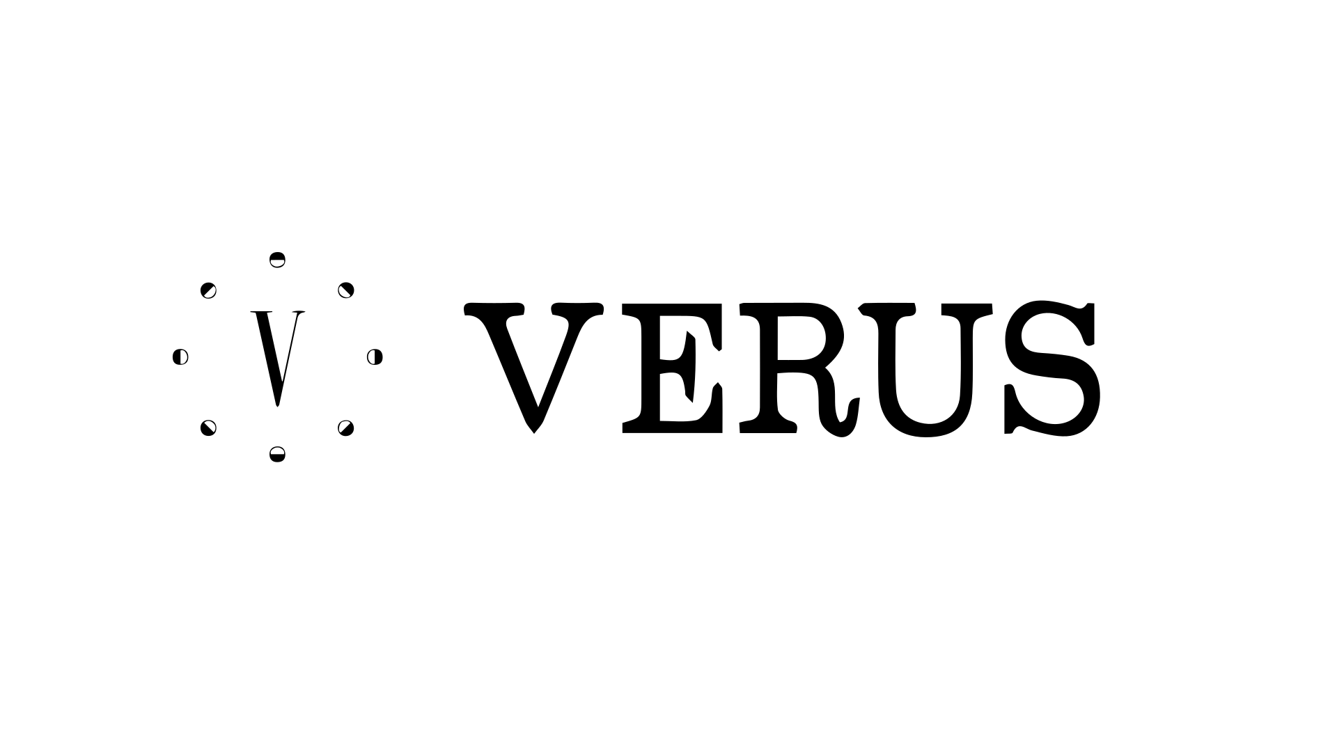
BrandingWatches / Retail2024
Veurs Watches Branding
Brand identity for a watch brand based in Switzerland.
8+
Deliverables
SVG/PDF
Formats
3
Revisions
The challenge
Watch brands can look either very luxury or very generic. They wanted an identity that felt specific to them and that would hold up over time.
The solution
We delivered a logo, colour system, typography, and guidelines. The identity works for packaging, retail, and digital.
Project details
Veurs Watches is a watch company based in Switzerland. They sell watches and needed a visual identity that would work on the box, in the store, on the web, and anywhere the brand shows up. Swiss watch branding carries certain expectations - precision, clarity - and they wanted something that felt aligned with that without copying the usual luxury codes. We designed a logo that works at small sizes (on a dial or a tag) and in headlines, chose colours and type that feel refined and legible, and wrote guidelines so the brand stays consistent. When people look for a watch, the brand had to feel like a serious option.
Services
- Brand Identity
- Logo Design
- Brand Guidelines
Stack
Logo DesignBrand IdentityVisual Identity
Want work like this for your team?
Tell us about the workflow limiting growth or dragging efficiency. We review whether there is a practical diagnostic path before discussing scope.